
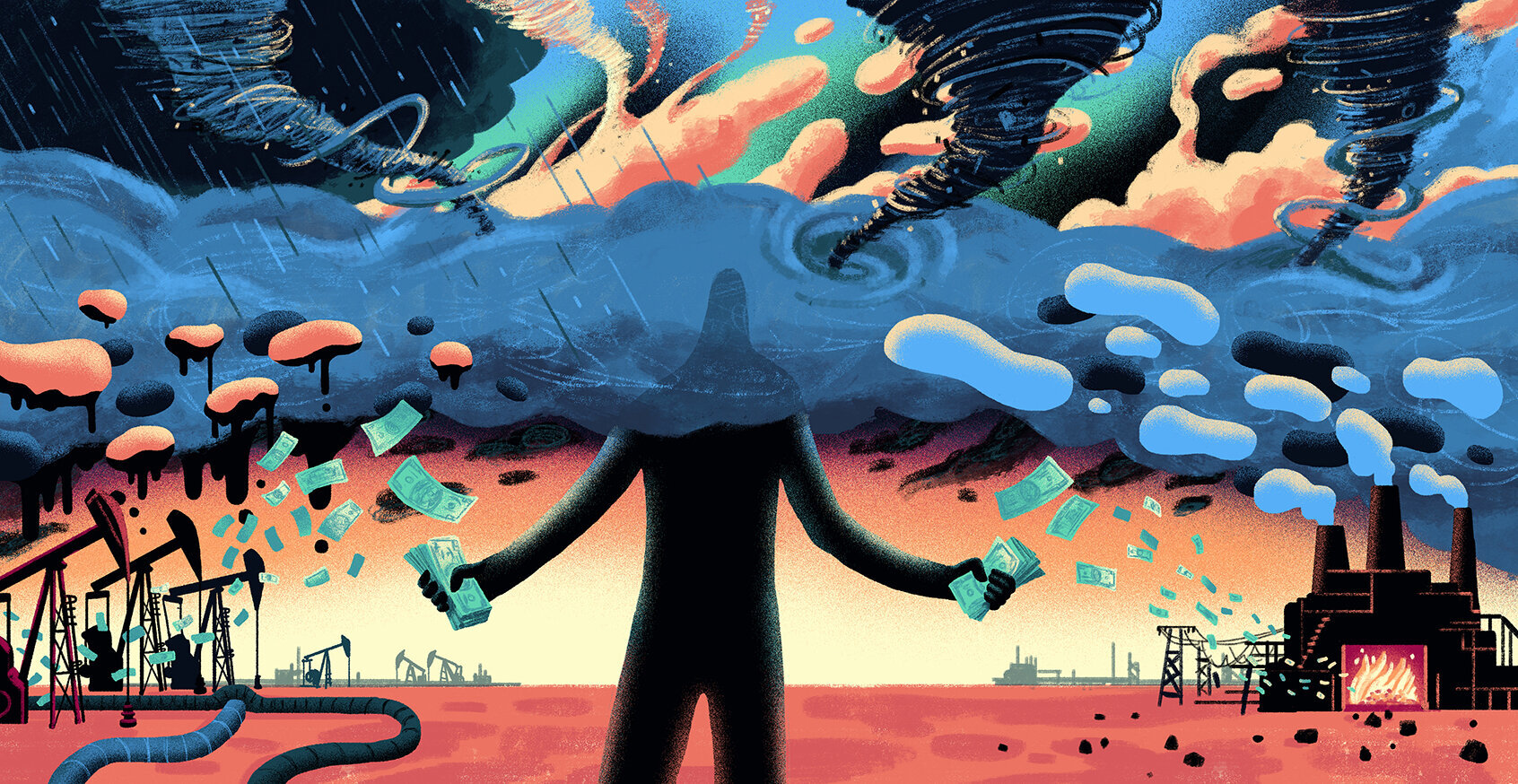
Energy use tells us what sectors (and countries) are filthiest, why China will rise (and the US will fall), and how oil is becoming a “stranded asset”

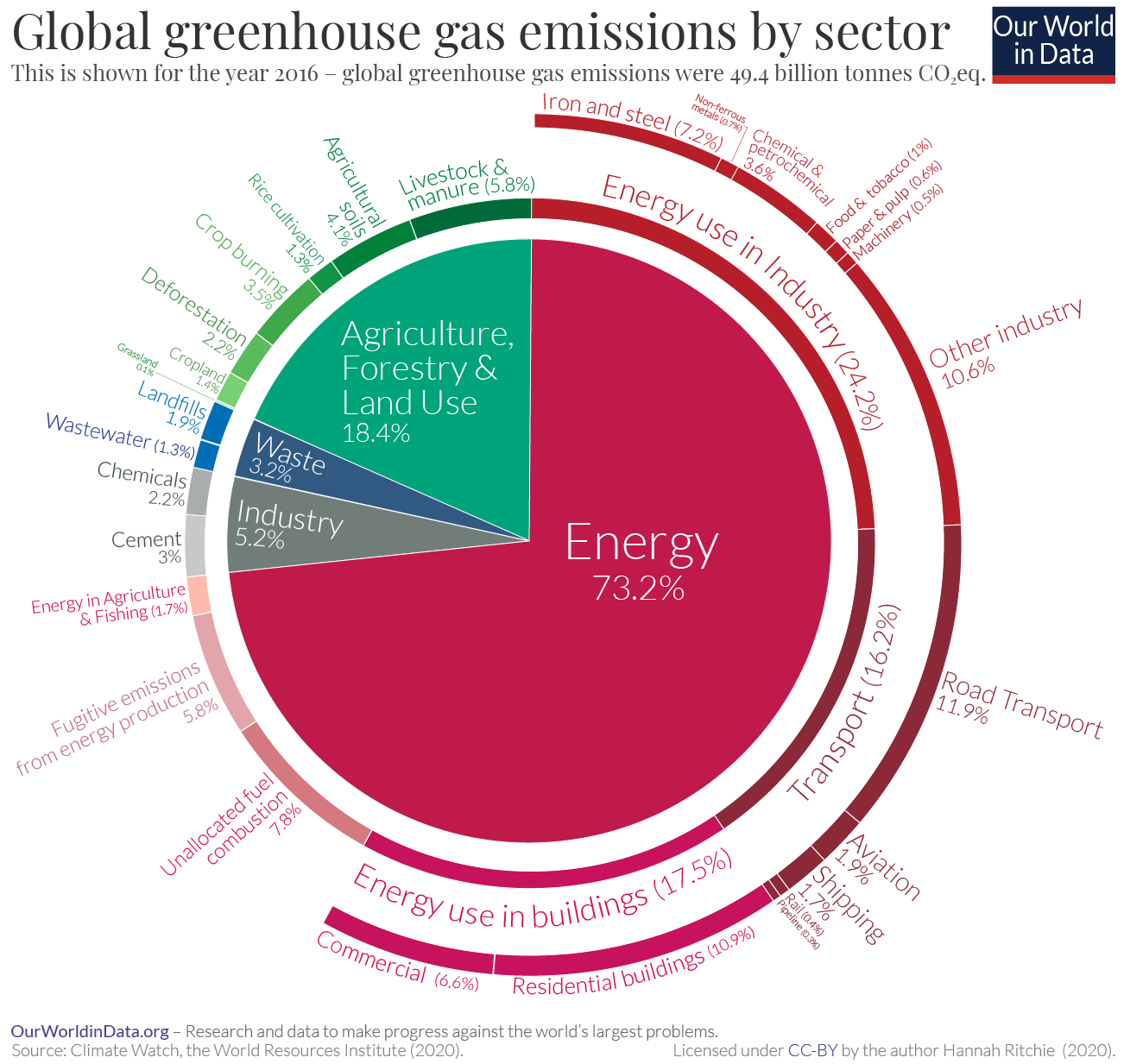
We’re always on the look-out for clear, striking info-graphics and messaging which allows citizens to grasp their climate responsibilities. Here’s a great image from Our World In Data, which has tried to show global greenhouse gas emissions by sector (caution: these come from 2016 stats, but they probably represent the state of play right up to the pandemic moment).
The background paper makes some interesting points:
The overall picture you see from this diagram is that almost three-quarters of emissions come from energy use; almost one-fifth from agriculture and land use [this increases to one-quarter when we consider the food system as a whole – including processing, packaging, transport and retail]; and the remaining 8% from industry and waste.
…It is clear from this breakdown that a range of sectors and processes contribute to global emissions. This means there is no single or simple solution to tackle climate change. Focusing on electricity, or transport, or food, or deforestation alone is insufficient.
Even within the energy sector – which accounts for almost three-quarters of emissions – there is no simple fix. Even if we could fully decarbonize our electricity supply, we would also need to electrify all of our heating and road transport.
And we’d still have emissions from shipping and aviation – which we do not yet have low-carbon technologies for – to deal with. [Though there’s promise in both shipping and aviation…-Ed]
To reach net-zero emissions we need innovations across many sectors. Single solutions will not get us there.
More here. For an interesting and instant discussion and minor correction of the image, see the thread of responses below the original tweet. The thread brought up this supplementary image (see embed, left), identifying the most difficult sectors to decarbonise.
It also seems to us really obvious that transportation costs are a huge part of this - as well as the mega-manufacturing system that transportation supports. Radical localisation, or DGML/cosmo-localism, may be a paradigm shift worth considerng…
***
Once you identify a meme, much else starts to circulate around it. For example, one might want to overlay this sectoral information with another frame - one that identifies which countries/zones might be most responsible for a warming use of energy.
Jason Hickel, in this Science Direct paper, gives a concise answer (but again, crunching figures from quite far back - 2015). Hickel is using the “planetary boundaries” framework, where nations and regions are measured as to whether the stay or stray from the “safe operating space” - between humane social conditions and biosphere limits:
As of 2015, the USA was responsible for 40% of excess global CO2emissions.
The European Union (EU-28) was responsible for 29%.
The G8 nations (the USA, EU-28, Russia, Japan, and Canada) were together responsible for 85%.
Countries classified by the UN Framework Convention on Climate Change as Annex I nations (ie, most industrialised countries) were responsible for 90% of excess emissions.
The Global North was responsible for 92%.
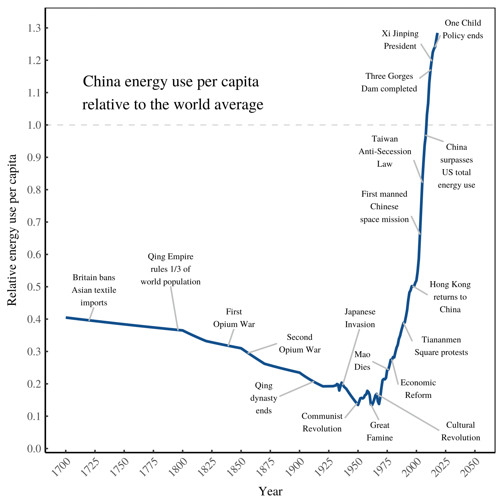
By contrast, most countries in the Global South were within their boundary fair shares, including India and China (although China will overshoot soon).
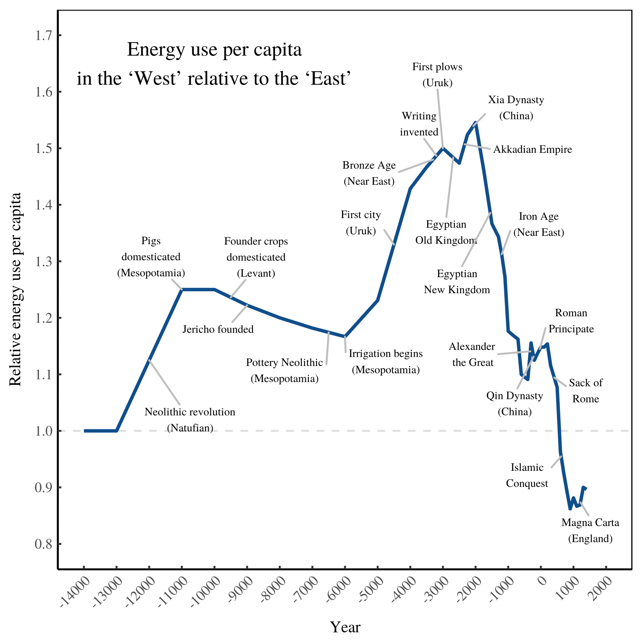
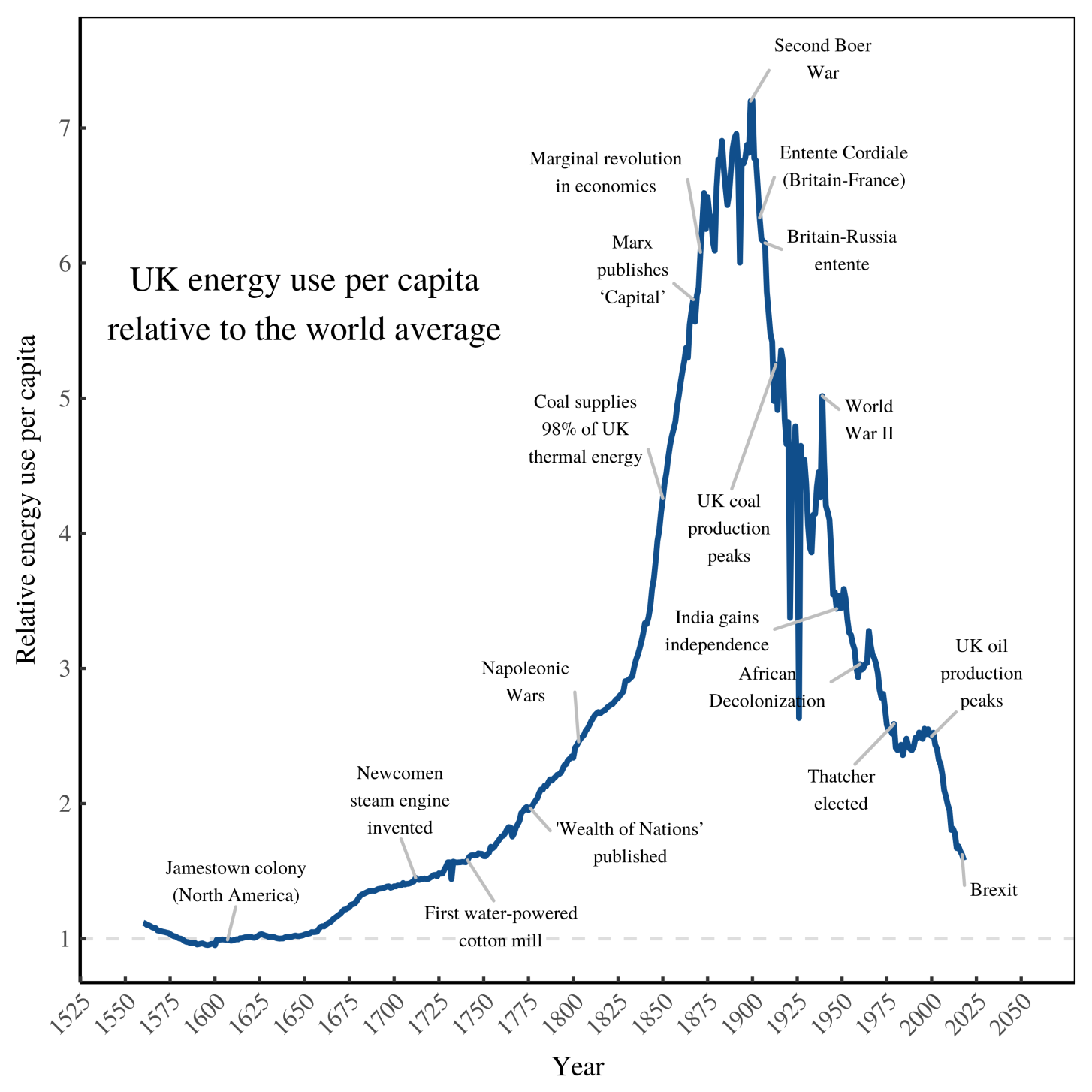
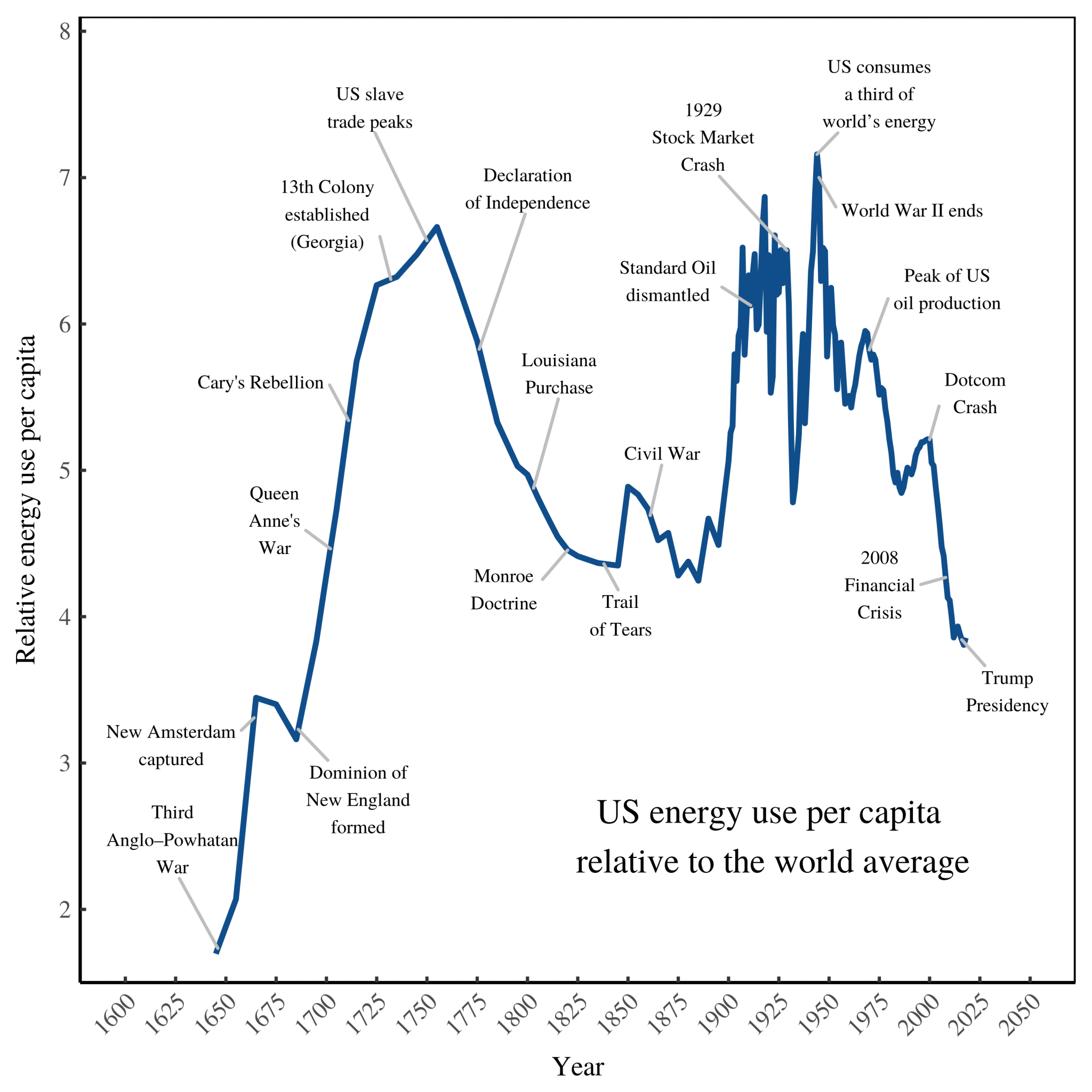
Note the last point on China (and the coming overshoot of its “fair share” of carbon/energy emissions). We also found this week a fascinating blog whose main concern is to show how “America won’t be great again”.
This is by showing how the US matches the pattern of energy usage for other empires: when they are at their most powerful, their energy use is most centralised to the imperial core (and much greater than the world average).
We’ll post the significant graphs below (and the sources for the graphs are below the pictures on the original blog). But they show that Chinese centralised energy use is on a relentless peak, compared to American decline (and other imperial declines, including the 15,000 years of civilisation post-Levant, and the British Empire):
***
Finally, from the ever-insouciant Boing Boing blog, a report on BP (British Petroleum)’s startling assessment of the prospects of its own carbon-based energy business:
With a single stroke of the pen, BP has written the obituary of the global petroleum industry. The Anglo-Persian Oil Company that once fuelled the British Empire and long defined Big Oil has confirmed what the technology fraternity has been saying for the last five years. Bells do not toll any louder than this.
The two key scenarios released at BP's capital markets forum – at least the two that it believes in – tell us that world oil demand has already peaked forever near 100m barrels a day and will soon go into precipitous decline.
It will fall by three quarters to 25m barrels a day by 2050 under BP's Net Zero forecast, mostly for plastics. By then cars will be electric (or better). Heavy trucks will run on hydrogen, aircraft on green synthetic jet fuel. Half the world's proven reserves (1.7 trillion barrels) will never be needed. They are already stranded assets.